
It's interesting to see how a product is launched in two test countries at the same time. The case is Coca-Cola BlaK.
(Big images in post - continue reading more inside!)
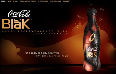
In the US it is clearly the coffee presence that is advertised: “new coke effervescence with coffee essence”. The communication in the US is product based. The formula is quite simple: Coke + Coffee = BlaK. They don’t feel the need to push further the message to captivate their young/trendy/urban target because the mix of these two ingredients has enough of a strong appeal, already.
And the website is not different. Really classical product demonstration, goodies, there is also an "art gallery" but it's not really convincing.
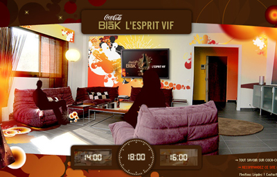
Whereas in France the communication is based on the effect of the product, not on its formula. The tagline reads “L’esprit vif”, something close to the "sharp mind".
To reach the same target, the French agency Marcel République developed a communication strategy based on " What’s in there for me, if I drink it? I’m beyond looking for coolness or hip, i drink coffee, so why should I drink that?" Instead of going for the obvious “it got coffee inside, stay awake, yeah!”, they choosed an uncommon angle: BlaK helps you going further, not in a physical way but on an intellectual level.
The website follows this line. It let the visitor discover different places, all heavily designed in BlaK. The navigation is intuitive, the product presence is strong but more suggested than imposed.
So which one do you prefer?
Adland® is a commercial-laden heaven and hell for advertising addicts around the world.
This advertising publication was founded in 1996, built on beer and bravery, Adland® now boasts the largest super bowl commercials collection in the world.
Adland® survives on your donations alone. You can help us out by buying us a Ko-Fi. Adland® works best in Brave browser


I prefer the French one - strategywise. I like the way it's designed better too.
- reply
Permalinkditto.
- reply
Permalink