

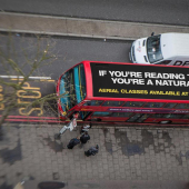
Logo's are always a hard problem, big ideas in small fonts seem to work best. What happened here, a brainsync or homage to a classic Gill logo? You decide.

This is Bob Gills logo for AGM, also featured in Unspecial Effects for Graphic Designers, and Gills own portfolio for many years I'm sure.

You might recognize this one if you are a fan of Six Feet Under. It was concepted by Brian Short who also won an award for the great titles of the show, the Communication Arts Design Annual, Award of Excellence 2001.
This animates at the end of the show, the elephant starts out large, but then the much larger hand arrives in the shot. Considering the name of the company, it's quite possible that this is a homage to Gills old logo.
What do you think?
I built this website. From scratch. Including the servers.
Adland® is a commercial-laden heaven and hell for advertising addicts around the world.
This advertising publication was founded in 1996, built on beer and bravery, Adland® now boasts the largest super bowl commercials collection in the world.
Adland® survives on your donations alone. You can help us out by buying us a Ko-Fi. Adland® works best in Brave browser


- reply
Permalink- reply
Permalink- reply
Permalink