

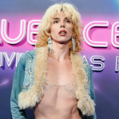
Most people criticize Starbucks for their expensive drinks, complex menu and crazy sizes, but a Christian group is taking offense to their new logo. According to them:
...the chain's new logo has a naked woman on it with her legs "spread like a prostitute... The company might as well call themselves Slutbucks".
Adland® is a commercial-laden heaven and hell for advertising addicts around the world.
This advertising publication was founded in 1996, built on beer and bravery, Adland® now boasts the largest super bowl commercials collection in the world.
Adland® survives on your donations alone. You can help us out by buying us a Ko-Fi. Adland® works best in Brave browser


The coffee at Starbucks is so bad they should get real prostitutes to make up for their poor product.
- reply
PermalinkThey've got a point - that logo is just crying out to be graffitied. And the slogan will be "Coffee, tea, me".
- reply
PermalinkI feel, for some strange reason, that I'm having an early nineties Deja vu. I used to work at Starbucks, and that was the "old logo" wasn't it? I mean that image. It was cleaned up by 1991, but we all used to giggle at the nipples and fish legs on that old logo.
- reply
PermalinkI'm having the same feeling. I'm not a Starbucks groupie, but I am a logophile. This design that looks like an early engraving is the original logo. They changed it years ago to a more stylised and logo-ised image, focusing on the mermaid's head, because huge swathes of middle America were made uncomfortable by naked breasts. The association of fish and coffee might not have helped, either. This was also when they changed from brown to green.
A history of the logo (and the name) is spelled out nicely around the middle of their Wikipedia entry.
- reply
PermalinkPerhaps Starbucks will start hiring baristas like this espresso stand in Washington State:
http://www.cnn.com/video/#/video/living/2008/05/20/jung.bikini.coffee.king?iref=videosearch
- reply
Permalink