
Earlier this week, Dabitch posted on controversy over the latest Bishop's Finger print ad. We weren't sent (yet...if you worked on the campaign send it in!) the "offensive" ad but the others in the series do have a similar theme.


Bishops Finger - the official beer of Adland
Adland® is a commercial-laden heaven and hell for advertising addicts around the world.
This advertising publication was founded in 1996, built on beer and bravery, Adland® now boasts the largest super bowl commercials collection in the world.
Adland® survives on your donations alone. You can help us out by buying us a Ko-Fi. Adland® works best in Brave browser


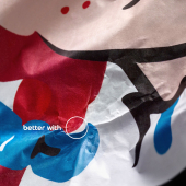


Wow. Are these ever horribly lame.
- reply
PermalinkReminds me of Hooker Beer:
http://www.liquidrugby.com/merchant.mvc?Screen=PROD&Product_Code=THB006&...
- reply
PermalinkNot only that, but two lines are nearly identical and (at least) one should have been scrapped. "Nothing tickles my fancy..." and "Nothing satifies me...." - coupled with the same girl to boot. This needed to be tightened up before it went to print.
- reply
PermalinkWhat a wasted effort. Could have been so much better.
- reply
PermalinkUnbelievably naff! Lovely piccies though.
- reply
PermalinkGreat beer, bad advertising.
- reply
PermalinkIs it just me, or are almost all of these women really f***ing ugly?
1) Nasty eyebrows with a creepy expression on her face
2) Wannabe MILF wearing WAY too much blush with her legs open like a ho
3) Eh, not too bad, but that pose doesn't suit her look at all
4) Reeeeally fake background and too much blush like before. And now with her hands on her junk. Not sexy.
5) Dear lord that woman looks hideous! She must have fallen out of the ugly tree and hit every branch on the way down with her face.
6) Same as #3- not bad, but certainly not good. These postures really aren't sexy though.
7) Just as fugly as she was in #5
Really crappy advertising with poor taste.
- reply
Permalinkheheehee you said "tightened up".
- reply
PermalinkPervs. The lot of ya.
- reply
Permalink