
Carousell, one of the largest e-commerce platforms in Asia, today unveiled a fresh new look which includes a revamped logo, brand positioning and visual identity developed by next generation, creative brand agency, Superunion. The updated look is being rolled out across Singapore, Hong Kong, Taiwan, Philippines, Indonesia and Malaysia
The new branding captures the power of positive experiences and possibilities living in the Carousell ecosystem, an app-first, peer-to-peer, digital marketplace where consumers and businesses exchange goods and services, including personal items like fashion and electronics, as well as cars and properties.
Ambrish Chaundry, Managing Strategy Director Asia said: "Working on the Carousell rebranding project has been very exciting for us. As they build momentum around regional expansion and widen their offering, it’s a perfect time to remind the world what makes Carousell special – a community of real people, “Carousellers”, who all want what is best for each other.”
Cassandra Leong, Brand Marketing Lead for Carousell, said: "Working with Superunion was a pleasure as they engaged the whole organisation, across departments and seniority, in arriving at a narrative and identity that captures our best selves. They have been true to what we stand for and yet have pushed us forward in terms of the brand identity and customer experience.”
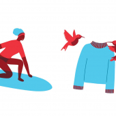
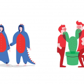
The big idea behind Carousell’s new visual identity is that behind every Carousell transaction is a win-win story. What sets Carousell apart from other online shopping platforms is that two real people, a buyer and seller, come together to make an exchange happen, creating a 'magic moment.' The new visual identity leverages pops of colour, charming illustrations, motion and overlapping shapes to bring these magic moments to life.
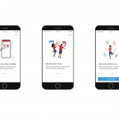
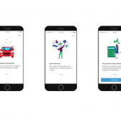
The Carousell platform itself has also been updated to be in line with the visual identity, simplifying its user interface and marketing communications to focus on Carousellers’ items and stories.

Carousell Logo:
The updated symbol mark maintains the original inspiration of the Carousell name and logo, the Kodak carousel, alluding to the cyclical nature of items going round and round. Superunion modernised the logotype and wordmark to reflect a vibrant yet trusted marketplace, and enabled the brand to live successfully in a digital-first environment. The five outward ‘fins’ in the symbol mark represent the company’s five core values, strongly embodied throughout Carousell’s product and culture.
Colours:
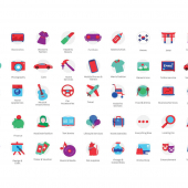
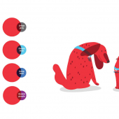
Red remains the core Carousell brand colour, now brighter, to represent the ambition of the brand looking into the future. A new suite of secondary colours have also been included to showcase the diversity of the Carousell marketplace.
Motion:
As a natural extension of the digital brand, motion has been incorporated into the visual identity, celebrating energy and movement, representative of the liveliness of the platform itself and serendipitous moments which occurs in its ecosystem.
The new visual identity is being rolled out formally in the coming weeks, beginning with app changes, as well as a brand campaign which will launch in September.
CREDITS
Scott Lambert, Creative Director - Superunion
Pete Tong, Designer - Superunion
Danley Stone, Client Director - Superunion
Charlotte Cheong, Client Executive - Superunion
Ambrish Chaudhry, Managing Strategy Director - Superunion
Sherman Chia, Senior Designer - Superunion
Cassandra Leong, Brand Marketing Lead - Carousell
Jem Seow, Senior Brand Marketing Specialist - Carousell
Davina Tjandra, Creative Design Lead - Carousell
Quek Siu Rui, Founder - Carousell
Marcus Tan, Founder - Carousell
Lucas Ngoo, Founder - Carousell
Adland® is a commercial-laden heaven and hell for advertising addicts around the world.
This advertising publication was founded in 1996, built on beer and bravery, Adland® now boasts the largest super bowl commercials collection in the world.
Adland® survives on your donations alone. You can help us out by buying us a Ko-Fi. Adland® works best in Brave browser


- reply
Permalink