Sports
Women’s Super League Football rebrands
There's a bunch of rebranding of women's football in the UK and they made a fancy
There's a bunch of rebranding of women's football in the UK and they made a fancy

Campaign for OVO smart home system created by Saatchi & Saatchi. CREDITS CAMPAIGN TITLE: Power Struggle CLIENT: OVO ADVERTISING AGENCY:
Philips Personal Health and 3D printer manufacturer Prusa Research collaborated with creative agencies LePub Amsterdam and LePub Milan, to redefine

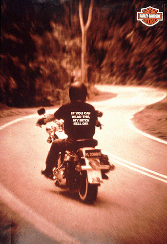
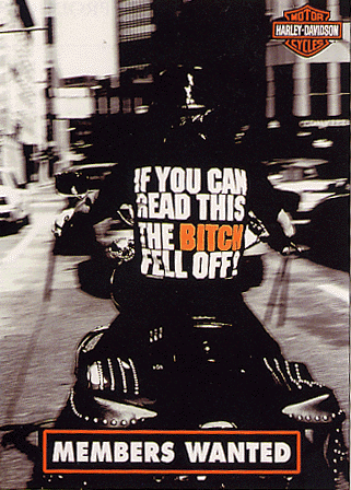
If you haven't read this line yet - what rock have you been hiding under? ah yes - that shirt. I remember it well. A colleague and I saw this image and promptly made such a shirt for our harley-crazy co-worker's leaving due. Did we see that shirt in an ad or in one of those images that get sent around emails? Can't remember. These two feel like they were an adaptation of each other..
They weren't. So what do you think? Trend? Aliens? Email-meme? Inflation? Accident? Or is the idea-god messing with us again? Heads up to our mate Errol, who points out that they both were in the New York festivals. Pah! Awards - what are they good for?
Agency: the asylum/singapore Title of Entry: "Bitch" Award Received: Gold WorldMedal Year Received: 2000 Client: Harley Davidson Competition: Print & Radio Advertising Category Magazine & Newspaper: Trade Sub-Category TRADE: CORPORATE IMAGE
Copy Writer: Olli Hesse Art Director: Michaela Kessler, Inga Glamann
text on shirt - if you can read this the bitch fell off.
Also interesting to note: appeared in issue 9 New york festivals 2000
