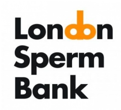
Phallus logo at least makes sense as twig and berries, but is it ripped off?

Earlier this week, the London Sperm Bank launched standalone brand, with the help of Colchester-based consultancy, Silk Pearce.

What's even more amusing, besides the quite obvious phallic reference, is that it is nearly identical to a logo I found on signage in and around Boston, MA 2 years ago for The Druker Company.

It's just another one to add to the list of phallic logos. At least in this instance, it makes sense to the brand...and is intentional--rip off or not.src="adland.tv/hallic-logo-and-unfortunate-name-combo">signage in and around Boston, MA 2 years ago for The Druker Company.

It's just another one to add to the list of phallic logos. At least in this instance, it makes sense to the brand...and is intentional--rip off or not.

Adland® is supported by your donations alone. You can help us out by buying us a Ko-Fi coffee.
Anonymous Adgrunt's picture
comment_node_story
Files must be less than 1 MB.
Allowed file types: jpg jpeg gif png wav avi mpeg mpg mov rm flv wmv 3gp mp4 m4v.