"Everything red becomes blue" shouts a new campaign for Vodafone in Sweden, which no longer will be called Vodafone, instead it will be called Telenor. The old droplet/quote logo in red is exchanged for some random fan/swirl in blue. Sonofon in Denmark joins in and use that blue logo - however they won't change their name. What is it about cellphone providers that make them want to change their names and logo's all the time? Before it was Vodafone, it used to be Europolitan. And before that, who knows... More inside for some oddly syncronized color mind games in a badland triple. Color game number one:
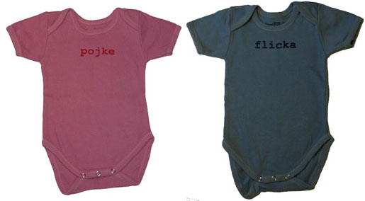
Beckers, the paint provider has a campaign where colors are mismatched with words that don't fit them at all. "Easter" is painted on red, while "Xmas" is painted on yellow. Blue is homosexual. Pink is straight. Babyblue is girls, pink is boys! Endless variations. Attention to detail, even the rainbow in the logo which is on its own poster is hand painted.