It was bound to happen..... *hanging my head in shame*....
So finally I hang my head in shame in Badland. No I don't actually - I'm glad to be here. For Badland, I do after all try to only pick ideas that are pretty darn good in the first place. There are gazillion campaigns out there who rely on no idea, just black and white photography. You don't see any of them in here. There are even more that use the same fonts, or the same stock photo, or the same layout. (I have on occasion, put up a page of layout ideas). It's the ideas that actually stand out - and then are repeated - that are interesting. Are they ripped-off? Or was the world "ready" for it? You might think it's easy to judge that, given all the information of dates produced and awards won that I normally provide, but none of the cases are black and white. (old age is making me go soft - Okay?)
I believe that some ideas simply work on their own agenda. And I also believe that too many coincidences in one go (such as you showing a great idea to someone at an agency - and a month later that agency produces that ad without your help and a really bad choice of photographer...) can reveal the hacks amongst us, those who can't think but steal. I also believe that it is completely possible for people independent of each other to come up with the same solution to the same problem. Sometimes it just happens.
So what's happened here?
Adlister Alex hollers "Dabitch in Badland" on the list the tenth of May 2001 and says: "I'm sure you won't have seen this. But they might have seen your ambient poster campaign for that music website (which was infinitely better, smarm smarm)" and directs us to: https://www.carnyx.com/The_Marketeer/roses.htm - Download the pdf and have a look at the ambient media section!
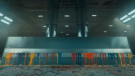
Agency:Cheetham Bell JWT Title of Entry: "Ice Hockey" Award Received: Commendation Year Received: 2001
Copy Writer: Martin Dickson, David Wakefield Art Director: David Wakefield, Martin Dickson
text on frame - "Sunday Pink" and tagline "Get a piece of the action"
Clever use of media.Damned clever. Hold the puns.

Agency: wa Amsterdam Client: sonox.com
Copy Writer: Åsk Wäppling Art Director: Åsk WäpplingStrategy: Ab Winsemius.
text on poster - The idea is that you read the poster and account for the framed background (just like the poster above), but it is also a rebus that you must solve. (not a very hard one..) The giant rock plus the word "steady" would read "Rock Steady". The framed roots of a tree are read, "roots".
Now I know that when these ads were run, it showed up in some dutch and american press, but not any british press. I doubt the team with the hockey-idea ever saw this campaign (there are six variations). Also - the hockey idea was produced first! So there!


Adland® is a commercial-laden heaven and hell for advertising addicts around the world.
This advertising publication was founded in 1996, built on beer and bravery, Adland® now boasts the largest super bowl commercials collection in the world.
Adland® survives on your donations alone. You can help us out by buying us a Ko-Fi. Adland® works best in Brave browser