Barclays, official banking partner of The Championships, Wimbledon, has unveiled a new integrated campaign starring tennis icon and Barclays ambassador
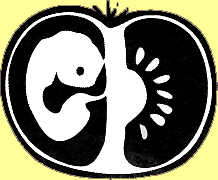
A logo for greenpeace and a logo for a newspaper - end up looking almost exactly the same?
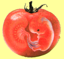
The Tomato-baby in color is Greenpeace's Logo against genemanipulated foods. It was designed by Karin Lodin at her design agency Lodin Design and has been used by Greenpeace for the past three years. The Black and White Tomato-baby was designed by two students at RMI Bergs in Stockholm while they were working on a live brief for the magazine "Skolan" (It literally means 'school' and is a fact-newspaper for younger children if my memory serves me right). Who the students are isn't revealed in the article. Karin thinks it is obvious that the students have copied her logo and Greenpeace agrees. "One wonders if they teach students at RMI to plagerise." Karin comments.