The same visual...but different ideas!

Here's a new one for the fodder - same visual - different idea. Try that one on for size.

............................Ops!!

quarantine poster

Client: Gametek

Agency: Crispin & Porter, Miami

AD: Markham Cronin

CW: Pieter Blikslager

Line reads:
Quarantine
The delightfully violent driving game.

Seen In:
Communication Arts annual 1995

The Economist poster

Client: The Economist

Agency: Abbot Mead Vickers BBDO Limited

AD: Paul Briginshaw

CW: Malcolm Duffy

Line reads:
The Economist

Seen In:
D&AD annual 1995

Hmm...Well.. ........Same visual..Different subject.....Different idea...Same year.

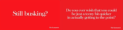
I really like the "delightfully violent" driving game ad, since it is so simple slick, and, I get it, unlike the economist. (I think the economist is trying to say that it get you out of the red or something, but what do I know.. Besides, I'm not their target-market.. Obviously).
I think it was coincidence.....but what does the Economist one really mean?? Get you out of the red? :)) Share your views!

Adland® is supported by your donations alone. You can help us out by buying us a Ko-Fi coffee.
Anonymous Adgrunt's picture
comment_node_story
Files must be less than 5 MB.
Allowed file types: jpg jpeg gif png wav avi mpeg mpg mov rm flv wmv 3gp mp4 m4v.
AnonymousCoward's picture

every economist ad has white copy on a red bkgd.
typically, the wite copy suggests a solution or makes a statement about the kind of person who reads it or about the publication itself. lately they have taken it a step further by using some sort of white visual instead of white text. for instance, the one that has a white puzzle piece missing from the red (and nothing else) suggests that the publication or possibly the reader are the missing link.

this execution simply means that the economist clears things up - and the fact that it is done with white space is what makes it so smart, commenting on all the great ads they have done in the past with white text.

that is just what i think.