

Hello dear adgrunts. I'm constantly trying to fix things for the better and make things easier to navigate and so on. It's a little lonely however, and I could do with some feedback right now. I need your input on this!
Just recently, I've added stars to the end of the headline for each super-adgrunt article (which is basically all the commercials) so that you can spot that content easy. See images inside.
Here is what the star studded site looks like to a non-logged in person. There's google ads (yuk!) and stars on the films this adgrunt can't view. The big embedded David Spade Axe film is access for all however, and there is no star there. Easy, right?
So what happens if this person clicks on a star-article? They'll be shown the way to login and upgrade. Not just with one link, but with five links and explaining text.
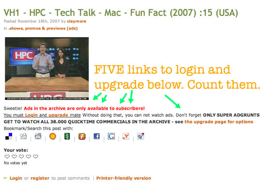
Regular adgrunts only get three links and text.

Still, ever day recently, regular adgrunts are emailing in asking how to watch ads. Now, we've had this problem before, the text under the screenshot is ignored, but I'm curious as to why this is. Can it not be seen? Is it too long and complicated? Should it be simpler, or longer, or bolder, or blinking, or funnier, or ..what? Is it's the text positioning or just the text itself that's the problem?
Super adgrunts get the film instead of the "you must upgrade"-text.

So, dear adgrunts, I'm soliciting your input. What can we do here to make things clearer? I've been tweaking that text forever now but once a day - no I'm not kidding, once a day so this is a serious problem - a regular (non-upgraded) adgrunt emails to ask how they view ads. I must fix this, clearly but I'm stumped as to how. What do you think?
I have asked the people who email in if they missed that text, but not one of them responded (not even after I started giving them 1 day upgrades in the hopes that they would scratch my back in return - I won't waste my time doing that anymore) so I honestly don't know what's going on. It is a bit like that odd phenomena where PR-people use this contact page to ask How do we contact you? - does it not say exactly how on that page?
Help me out here, what am I missing?
Adland® is a commercial-laden heaven and hell for advertising addicts around the world.
This advertising publication was founded in 1996, built on beer and bravery, Adland® now boasts the largest super bowl commercials collection in the world.
Adland® survives on your donations alone. You can help us out by buying us a Ko-Fi. Adland® works best in Brave browser


Here's my thoughts on your conundrum:
1. Web users are an impatient bunch and tend not to read anything! They just click and then worry about the consequences.
2. The red text might not be easy for some people to read (colour blind). Even if that were the reason, it can't cover every email you send. It does look quite messy as a piece of text, in my opinion.
I think the way it used to be done (where user was taken to a page that was text-only outlining how to upgrade and why that was necessary) was better - although you may be able to tell us if the amount of emails you get now is more or whether you get fewer.
Also, making the method of labelling premium content more explicit would make it better. I like the star, but it's easily missed and if I hadn't read this post I wouldn't have known that this is what the star denotes.
Of course, it could be that your general audience is a little bit short of intelligence or only interested in their own lives and that's why they keep missing the point. I stress the 'could be' part of that sentence. Don't flame me people!
- reply
PermalinkHmmm, good points purplesimon - I did get less emails back in the day (though, I did still get them!) so perhaps I should tighten up the layout of that text and make it explain more there...
- reply
PermalinkMaybe keep the star and add something where it says "posted", or how there is the label for where the ads go, could you create another thing where it shows "premium" or something like that?
- reply
PermalinkI have another idea: why not publicly humiliate anyone that sends you an email asking such a silly question. Especially the PR companies.
Sorry, I'm feeling spiteful today :-)
- reply
PermalinkI should put you in charge of the emails. ;P
- reply
PermalinkBack to square one - this is what the message currently looks like:

And this is an email I received ten minutes ago: "...and I was wondering if I sign up or upgrade to see SuperBowl Commercials, would I have to pay for this service. Please email me back at..."
Hmmm.. I can't even remember how I used to do it - did I really link to a page explaining the upgrade process? I thought we quit that years ago. Also, I thought the super adgrunt upgrade page now was pretty good at laying out the choices.. Guess not huh? Oh, I better fix the number of ads since we've passed fourty-THOU now. :)
- reply
PermalinkÅsk:
You should put:
"You need to PAY to subscribe for the Super Adgrunt Upgrade, which allows you to watch all of the 40,000+ Quicktime commercials in the archive, which includes all the SuperBowl Commercials in our archive."
right after the "You must Login and upgrade mate", and before the "- see the upgrade page for options".
You can leave the other piece there ("Without doing that, you can not watch ads. Don't forget ONLY SUPER ADGRUNTS GET TO WATCH ALL 40,000+ QUICKTIME COMMERCIALS IN THE ARCHIVE"), if you wish, or mash it into the piece I wrote....
I think this might help - maybe just a bissel. :-)
Allan...
"Remember, no matter where you go... There you are." (Buckaroo Banzai).
- reply
PermalinkThanks. Been changing that text and the signup page a lot now - even taking people to this page in the faq explaning what adgrunts can do once logged in, just so that people don't sign up and then ask to be deleted five minutes later. Personally I think just the whole "no google ads" is worth signing in for.
- reply
PermalinkUpdate the text looks like this now (screenshot). And it's still clearly not helping - see this comment
- reply
PermalinkTry removing the image of the commercial screenshot when a non-super adgrunt clicks to watch the ad. Many are used to YouTube: see it, click it, watch it. That might be causing some of the problems.
- reply
PermalinkCan't be done unless I recode over 40,000 posts unfortunately. :/
- reply
Permalink