The New York Times Magazine (free registration required) approached several prominent designers to create some good, old-fashioned advertising posters for the Democratic candidates for the U.S. presidency.
There's some good thinking going on there, a few interesting approaches, and a couple that just seem like bad ideas.
A good, good idea... let's face it, US political print generally sucks and is a going through the motions sort of thing (red/white/blue with stars conventions make me ill every campaign season). Great design, out there where people can see it, could go a long way toward creating excitement.
Loved Sharpton's and the lc 'i' s on Kucinich's (such a sucker for type) but thought the shift key would've been more appropos for Dean given his internet-driven campaign... though they should get points for avoiding the military card. As for Lieberman, yeah, it's a helluva challenge to make a candidate cool but ... I disagree with the notion that they're enhancing a personality as opposed to creating one. Didn't feel like him at all ... seemed like a sudden brand about-face. People don't buy such quick changes unless they're totally unaware of the product to begin with (heheh, though it could work considering the number of average Americans who know who Lieberman is).
- reply
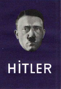
PermalinkThe lowercase "i" thing creeped me out. Alas, that because I remember this poster so well:
See more German Propaganda posters under that link. (sorry George, loved the Esquire stuff.. But not this "i"-pun...)
Is this one of the couple of 'bad ideas' you refer to Alphasquirrel? Or was it the illegible posters?
- reply
Permalinkai! No pun intended. Time for a refresher in design history, I guess.
- reply
PermalinkIs this one of the couple of 'bad ideas' you refer to Alphasquirrel? Or was it the illegible posters?
That is darned creepy . . . but not one of my original choices for truly bad; the Kucinch one just required too much explanation, esp. for a poster.
I thought two most misguided approaches are Lieberman as Dylan and Kerry as JFK -- trying to manufacture a tenuous connection to build an image based on someone else's life and beliefs. And in keying into baby boomers' imagery, not really connecting with the "market" that needs to be addressed.
And I completely agree with the comment about the Clark poster -- it's like the designer had the perfect Dean poster, but drew Clark out of the hat.
- reply
Permalink