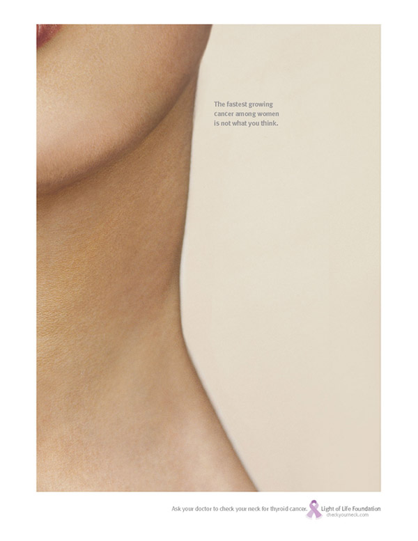
This ad wants you to do a double-take, the classic 'misdirect' lies in the art direction again, it looks simple enough but this body-part double was probably very hard to achieve.
Headline: "The fastest growing cancer among women is not what you think."
"Ask your doctor to check your neck for thyroid cancer. Light of Life foundation. checkyourneck.com"
Agency: Lowe New York
Creative Director(s): Gary Goldsmith/Dean Hacohen/Bernie Hogya
Copywriter: John Schildkraut
Art Director: Eider Suso/Bernie Hogya
Account Director: Alecia Fox
I love the concept, but even with the freaky missing shoulder, I didn't see it as maybe being a torso til I read the copy. Really tough to pull off...
- reply
Permalinktrue and the lips in the top corner are a bit of a giveaway...
- reply
PermalinkIt's a nipple! Yes it is!
I'll admit at first I saw a just neck and thought "feh.. not post-worthy" and it hung around my desk for a while.. But then I caught it off-guard one day and saw a breast and a waist.. oooh.. now that's pretty neat. So I posted it. :)
I don't think the web is the best place for it, on a bigger sheet of paper when you aren't prepared the illusion can work. But it is very hard to pull off as you can see. Still, I fancy the thought.
- reply
Permalinklooks like a tit to me
- reply
PermalinkOver here at PDN online Eye On Ads: Visual Ambiguity Works For Lowe's Cancer Campaign they have more on how they got this image.
- reply
Permalink