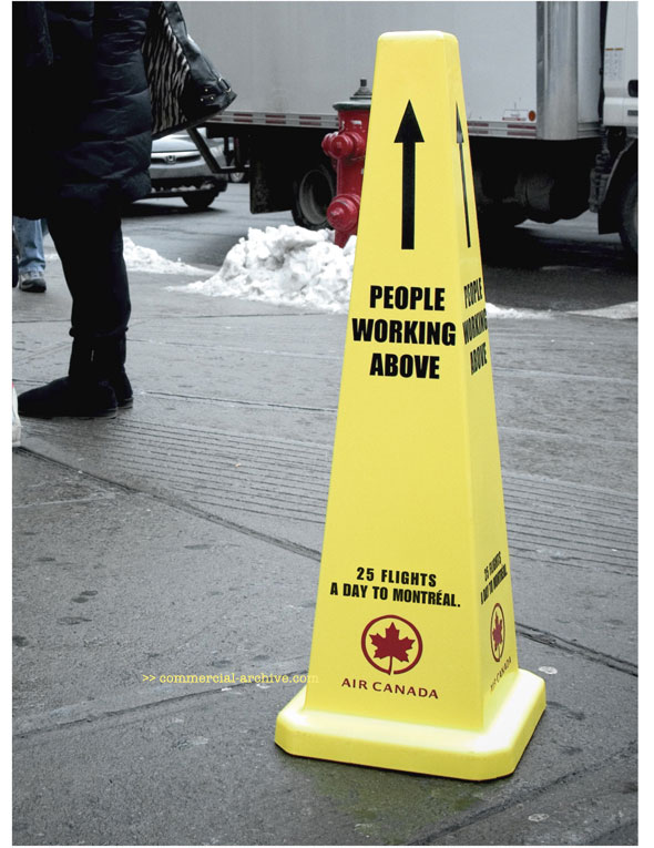


To promote Air Canada’s high frequency of flights between “Rapidair” destinations, namely Montréal, Ottawa and Toronto these cones were scattered about named cities. Ad agency Marketel, Montréal did the creative.
This is how old I am: when I first saw these I thought of the cones and various signs placed out in cold cities to warn for falling ice or snow from the rooftops. Then I got a wee bit ticked off that these do look like warning signs, eventually diluting the attention warning signs get. Lawn. Kids, Get off mine. I'll find my sense of awe for crazy ad ideas again, I seem to have misplaced it recently.
David Yost (Executive Creative Director)
Mitch Cayouette (Assoc Creative Director)
Markus Dressler & Hillary Wolfe (Art Directors)
Joshua Stern (Copywriter)
Alexandre André (Agency Producer)
funny, i misplaced my sense of awe for crazy ad ideas LAST week. it must be going 'round like the flu.
- reply
PermalinkI like 'em.
But shouldn't they say "PEOPLE WORKING OVERHEAD"?
"Above" seems a wee bit not totally right. But maybe that's just me being a bastard.
- reply
PermalinkThat's just asking for an "out of order" sign to be tacked onto it.
- reply
Permalink