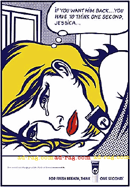
Belgian campaign revives old look for one second.

When I spotted (bad pun intended) Duval Guillaume's new campaign for one second breath mint I was instantly reminded of the Badlander Pore Bore back in 2k. But hey it's been six years I s'pose that now is as good a time as any to revive an old look and call it a "clearly differentiating visual style...." as CD/AD Dirk Domen said to Creativity magazine, even though it isn't. Read more to see the ads and a few more 50's cartoon style ads.

Previous hype on "one second", the world first one second advert, which wasn't the worlds first one-second advert at all.

Agency: Duval Guillaume, Antwerp Belgium, CD/Copywriter: Geoffrey Hantson, CD/Art Director: Dirk Domen, Illustrator: Seb de Roover


found in the 1999 AWARD annual (Australiasian Writers and Art Directors). The agency:BAM SSB, Australia. Client: Kao Australia (marketing) Pty Ltd.


Lürzers Archive (vol.2-2000) Agency: TBWA-GV/Company, Brussels Belgium Client: Nivea


Silver medalist (Outdoor/Transit/Posters: Products Services: Personal Care)New York Festivals 2000 (issue 9 pg 242)O&M Mexico City Client: Ponds Clear Pore Strips CD: Marco Colin CW: Javier Zapatero AD: Raymundo Valdez Illus: Alejandro Rodriguez

At least in the pore bores, the Lichtenstein/50's cartoon thing brings something to the idea, rather than being just style for style's sake. There are reportedly 20 different ads in the one second campaign though, I'm not sure if they all look like this.

PS: you can see the one second advert here.

Adland® is supported by your donations alone. You can help us out by buying us a Ko-Fi coffee.
Anonymous Adgrunt's picture
comment_node_story
Files must be less than 5 MB.
Allowed file types: jpg jpeg gif png wav avi mpeg mpg mov rm flv wmv 3gp mp4 m4v.
Plywood's picture

The first ad is horrible.
The second and third and fourth seem like unfortunate coincidences in 3 countries very far away from each other. Nobody in Mexico or Belgium would have access to the Australian award annual so I'm gonna give everyone a pass on this one.

Dabitch's picture

Since the last three cropped up at more or less the same time it seems to me a pretty funny brainsync. Perheps influenced by fashion.