

Over at Bold user, Bedford spotted a very funny set of logo twins which mean very different things.
While one means "port-a-potty" the other means "protection and service for people who rent their homes".
What the lingonberries in milk-red color mean in either logo is anybody's guess. 
Yes, folks, it's US-based Hampel Global Toilets versus the Swedish legal advice and rights group, Hyresgästföreningen.
Adland® is a commercial-laden heaven and hell for advertising addicts around the world.
This advertising publication was founded in 1996, built on beer and bravery, Adland® now boasts the largest super bowl commercials collection in the world.
Adland® survives on your donations alone. You can help us out by buying us a Ko-Fi. Adland® works best in Brave browser


Great find. Let's see them duke it out like Helvetica vs. Arial!
- reply
PermalinkHehe. This reminded me about a logotype that I saw some two years ago in one of my books. I scanned the following one from one of my logotype books "Trademarks of the '60s & 70's".
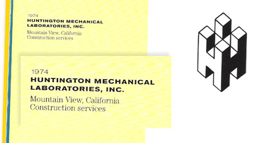
http://hem.bredband.net/b361940/squareh.jpg
- reply
PermalinkHeres the book btw:
amazon link
- reply
PermalinkDoes this remind anyone of....

- reply
Permalink