

Uh-oh! Quark express has decided to get a new look - the only problem is that someone else is already wearing it, the Scottish Arts Council. They're total twins! I guess we know which designer made use of all that tracing paper that was on sale... ;)
Adland® is a commercial-laden heaven and hell for advertising addicts around the world.
This advertising publication was founded in 1996, built on beer and bravery, Adland® now boasts the largest super bowl commercials collection in the world.
Adland® survives on your donations alone. You can help us out by buying us a Ko-Fi. Adland® works best in Brave browser


I don't see any similarities. One is clearly blue and the other one is green.
- reply
PermalinkGood thing one wasn't red and the other green - or else colorblind people would be seeing the exact same grey Q!.. Hehehe. ;)But the best comment was said by hal9k at Metafilter:
- reply
PermalinkThe funniest part of the press release at Quark is the headline:
Show everyone why I’m different . Riiiight.Did they hire Logoworks to design the new logo?
- reply
Permalink...hang on. Isn't the Quark logo supposed a Q, while the Scottish Arts Council logo is an A?
- reply
PermalinkYaknow, that could be the only thing that speaks for this being a complete freak accident. Honestly. But boy is it freaky.
- reply
PermalinkIt seems to be yet another one out there =:-o
http://www.artworkers.org
- reply
PermalinkOh my! Well, this another A... Wonder if this is from a font?
- reply
PermalinkIt is.
It's the lowercase "a" from Peter Bruhn's Girl typeface.
See here for reference:Veer comments September 10
- reply
PermalinkAhaa!well that solves that mystery.
How lazy is it when a designer uses a single letter from a font as a "logo"? .... perhaps the Quark guy was dyslexic....
- reply
PermalinkOr didn't realize he was hitting the "a" key when he meant to hit the "q"...it is right above it after all. Only other thing is, it's possible too that if it's the same font, the Q and A look similar...there's a slight difference in that the hole in the Q is bigger than the one in the A which also could be way it is in the font.
- reply
Permalink.. wow, you're right! That explains the hole size-change!
So incredibly lazy!
- reply
PermalinkThe Akedemiks clothing brand logo, is pretty close in overall form as well.
- reply
PermalinkBrilliant!
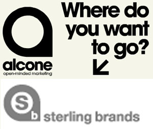
This will never end it seems, I submit these two to the list, Alcone Marketing and Sterling brands:
Alcone seems to have 'borrowed' thei rline as well...
- reply
Permalink