
Reading through my news sites this morning, looks like Mac is again buying ads that dominate and reference the newspaper home pages they appear on, such as The New York Times.
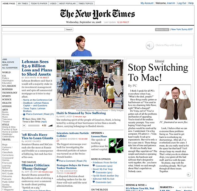
Like the ones from a couple months back, these ads take advantage of their space and format in a way few banner ads do. Adding to the effect this time is an editorial from PC, kind of made to look like it's part of the page, that urges people to stop switching to Mac, noting "That's what you do in relationships, you ignore all the bad stuff, and live with the pain."
So while Microsoft embarks on … well … whatever it is they're doing, Mac continues to hammer on Vista's flaws and users' frustration, even as today's NYT notes the steps Microsoft's taken to improve. I just like seeing agencies doing something interesting with banner ads; heck, I even turned the sound on.
Also spotted over at The Washington Post.Reading through my news sites this morning, looks like Mac is again buying ads that dominate and reference the newspaper home pages they appear on, such as The New York Times.
Edit by Dabitch: For those of you that missed seeing the ad in action - here it is!
credits! Ad created by the TBWA\Media Arts Lab
Ben Foushee, Mad River Post : Editor
Lee Clow : Chief Creative Officer
Duncan Milner, Eric Grunbaum : Executive Creative Director
Jason Sperling : Creative Director
Chuck Monn, Jamie Reilly : Associate CD / Art Director
Krista Wicklund, Kevin Tenglin : Senior Copywriter
Serena Auroux, Joannah Bryan : Agency Producer
Director : Phil Morrison
Production Company: Epoch Films
Lead Interactive Designer - Ryan Conlan
DoP - Peter Donahue
Post Co - Mork and Lys: Brandon Sanders
Post Co - Company 3: Stefan Sonnenfeld
Adland® is a commercial-laden heaven and hell for advertising addicts around the world.
This advertising publication was founded in 1996, built on beer and bravery, Adland® now boasts the largest super bowl commercials collection in the world.
Adland® survives on your donations alone. You can help us out by buying us a Ko-Fi. Adland® works best in Brave browser


I do like this banner campaign, they are entertaining in their little Mac vs PC way. And they don't run that often so when a new one shows up you actually pay attention (as they buy the front of major newspapers too). Few advertisers could do that, even if they did smart use of several banners, they might not have people turn on the noise like we do with these.
- reply
PermalinkClever use of digital space is the key to great online campaigns such as these.
- reply
PermalinkClever use of digital space is like clever use of any space. The novelty will soon wear off if you don't have a strong campaign idea first. Apple has a strong campaign idea, and this just proves that strong ideas travel media well.
- reply
PermalinkAgreed. What I meant was that moving out of the standard banner space is a good way to do more with a campaign thought online.
I actually posted my comment before I'd finished writing it and decided not to edit. And Wham is playing in the office, so I'm distracted (and not in a good way). If that's any excuse!
- reply
PermalinkKill your office-mates. Wham is not tolerable.
- reply
PermalinkIt's not the main reason I'm quitting, but it's one of them!
- reply
PermalinkJust remember to "Wake me up, before you go go...", as you leave.... :-)
- reply
PermalinkI'm loving these ads. I'm not from there but I've notice that Apple is hittin NYC harder than anywhere I've ever been. If feels like Apple has completely taken over the subway system w/ so many adds.
The sub does look better!
check my blog at http://ryanagraves.com
- reply
PermalinkHahaha, thank the art director at TBWA/Chiat for beautifying the NYC subway?
- reply
Permalink